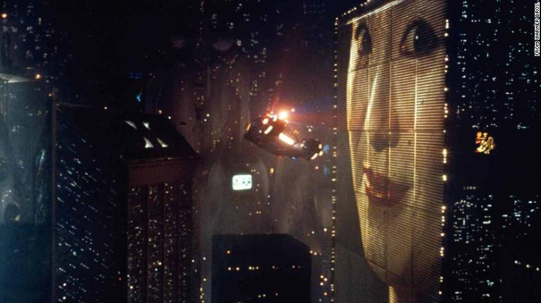
Cut to the Chase
Unintentional action movie pun, awaaaaaaaaaaaaaaaaaaaaaaayyyyyyyyyyyy!!!!!!!!!!
Part of me wonders what Rem Koolhaas thought about Blade Runner if he saw it... either when it came out in 1982 or recently. I think the 80s rendition of 2019 is simultaneously quaint and pretty spot on: on the one hand, the digital billboards (which are a step away from being fully animated in reality the way they are in the film), the video calls, and the continued existence of racism (coupled with police brutality for an extra "bonus" prediction); on the other hand, flying cars. Back to the Future promised them, too... five years ago.
But in terms of architecture, it's a startlingly relevant smashing of new and old. There's the decorative apartment building where the character of Sebastian lives with the ornate railings and pull-gate elevator cheek-by-jowl with the tall, light-speckled colossi of impossibly high skyscrapers and clinically smooth and squat buildings that look like pottery or 3D printing with the layering smoothed... to say nothing of the imposing and futuristic ziggurat-like structure of the Tyrell Corporation, where the concept of Replicants was conceived. Putting aside the socio-political themes (which are dark as absolute fuck), the architecture of the movie alone was, to me, unnerving on some level.
I think it's a good visualization of Koolhaas's point of a
culture of congestion… or what I would consider to be a culture of congestion. It’s the medieval city: the narrow streets
and back alleys that twist and turn and form a tangled mess where people scurry
hither and yon (on feet or wheels) like rats.
The drawing Koolhaas did—and he should know his own concept—strikes me
as only half of the story.
Each block is individual and unique, sure; each one is its
own little world (real or not) inside the larger world. But the drawing to me seems displayed like an
exploded axonometric drawing to better illustrate the concept. The reality when you follow the dotted lines
or fit the pieces together is a dense mess that’s difficult to penetrate unless
you know it inside and out—the way Koolhaas saw and knew (and assumingly
continues to see and know) New York and the way that Deckard saw and knew his
Los Angeles.


Kari, I do also wonder what some of these starchitects would think of films like Bladerunner, or even Metropolis (1920s). I would like to think they watched them much like we are doing today, with curiosity and and open mind.
ReplyDeleteSpeaking to the Koolhaas drawing, I do feel like it has an interestingly small detail that I noticed yesterday. The buildings, as unique as they are, all fit into a NYC block. The idea of modularity comes to mind when thinking about a puzzle of buildings trying to fit into the world, but the world just cant fit them all. In their day and age, many of these buildings faced scrutiny just for being different and pushing modern technology. In other words, Earth's hole is square, sometimes to perfect, whereas these puzzle pieces are rectangular, maybe unable to even fit into the world space.