I Hate Eisenman's Architecture
Many years ago, when I was a naïve, undergrad architecture
student at Miami University, my class and I went on a field trip to see the
architecture of downtown Cincinnati. One of the buildings we visited was
Eisenman’s College
of Design, Architecture, Art, and Planning (DAAP). Though I was still at
the very beginning of my architectural career, I remember my initial
reaction to Eisenman’s architecture-- I hated it. I'll admit, it seems out of my nature to say such a word as 'hate'. But I have your attention, right?
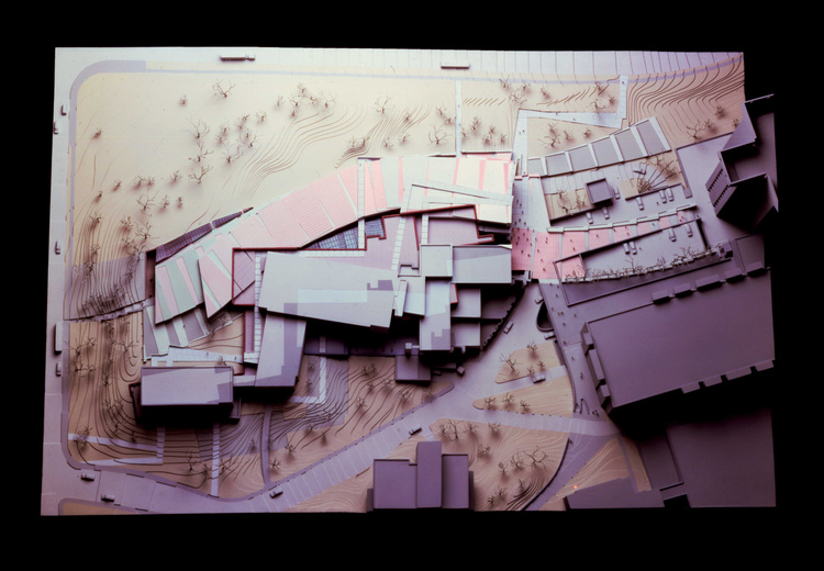
Here is why I hated his architecture: the walls and ceilings were painted a variety of
pastel colors, there were sharp, jagged angles, and extruded volumes going every which
way. My eyes did not know where to look and I had no idea where to go. Since
that visit, I’ve had time to ask DAAP students if they enjoyed having classes in
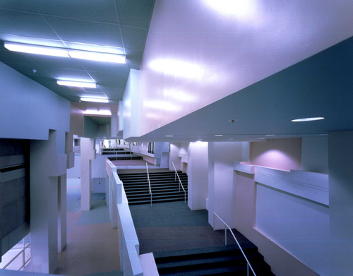
that building. They described spaces that had awful acoustics, bad artificial lighting, and rooms of awkward shapes and sizes.
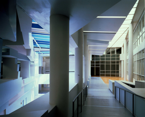
Don't get me wrong, I appreciate his complex process when designing DAAP. As stated in an article by The Chronicle of Higher Education: Eisenman was inspired by "...the angles at which the three older buildings met, as well as from the site itself. He took those angles and spun them out, iteration by iteration, into the new building's broad interior spine...then he let the topography twist and turn and torque that spine as it went downhill. The building's highlight is its interior, particularly the spine—a long, rising, shape-shifting open space that serves as corridor, stairway, and classroom."
His architecture is further explained in the intro to Eisenman’s
Postfunctionalism:
“Rather than simply deriving its forms from
functional needs, Eisenman sees modernism as “work on the language itself…It fundamentally changed the relationship between man and object away
from an object whose primary purpose was to speak about man to one which was concerned with its own objecthood.”
But after visiting DAAP, I would argue that Eisenman’s architecture is so concerned
with its own 'objecthood' and language that he has forgotten about the user. Why
is this considered good design if experiencing it is confusing and difficult to enjoy?


I believe that sometimes a building can look good in plan, section, elevation, etc. but fail however to be a livable space. I think if a building doesn't live in the context of the site, it becomes less powerful than one that does. It's also possible that it is the zeitgeist of 80's-90's and doesn't hold as much strength today in style.
ReplyDeleteAs a past student there, I and many others have mixed feelings about the building. It is so complex that I have had to help more than one lost couple to find their way out. It was cold and not well lit in the common spaces. But there was also something to the odd little spaces the geometry created, there were nooks and cubbies everywhere for reading, sleeping, working. Everyone seemed to have there own place they went. I also disagree that it is entirely geometric in nature. The entire central connection piece is a grand staircase that connects 4 levels. It is a meeting point, a place of presentations, fashion shows, a place to sit. While I don't think the environment showcases the greatest in architectural achievements, there is also something to it after spending 4 years of my life in one of his buildings.
ReplyDeleteAn intresting question to pose would be if Eisenman himself would enjoy working in the space he created. If "starchitects" designed spaces bearing in mind that they themselves would occupy them, would anything be any different?
ReplyDelete