Clutter
Many of the social housing projects we have seen in class create simple living spaces open to the crafting of the users to make it their own. In the midst of creating these blank spaces, many of the examples we have seen in class show living spaces that have been personalized beyond the building envelope, spilling out to create sometimes unsightly piles of belongings on outdoor terraces, porches, or landings. Many architects instill provisions to attempt to prevent this type of growth from the users, but ultimately, from the examples we have seen, it seems to be an inevitable defeat.
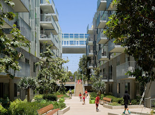
Koning Eizenburg, an influential L.A. firm, designed a social housing complex in Santa Monica, California. The unique design highlights intricately landscaped communal space, bright colors in contrast to natural materials, and projected porched that create a playful facade that allows guests to truly extend into their environment. At first glance, it appears to be a seemingly natural, cohesive establishment, but upon closer inspection, one can see that every porch has the exact same table and two chairs, and nothing else. The architect and homeowner's association mandated that every porch have these three items and nothing else.
It is amazing that this idea can be enforced, but how long will the users follow this guideline before the terraces begin to look more like the ones of the inhabitants of the Nemausus?


Comments
Post a Comment